Start with the room’s existing textures
A room already contains a vocabulary of surfaces: linen, plaster, timber, glazed ceramic, perhaps a polished tabletop. A desert texture can echo one of those materials or introduce a useful contrast. Fine sand ripples may sit comfortably beside loosely woven fabric. A dense stone study can ground a room that otherwise feels very smooth. Look beyond whether the photograph matches a cushion. Ask whether its visual weight and movement add something that is missing, or merely repeat what the room already says.
Learn to see small changes in light
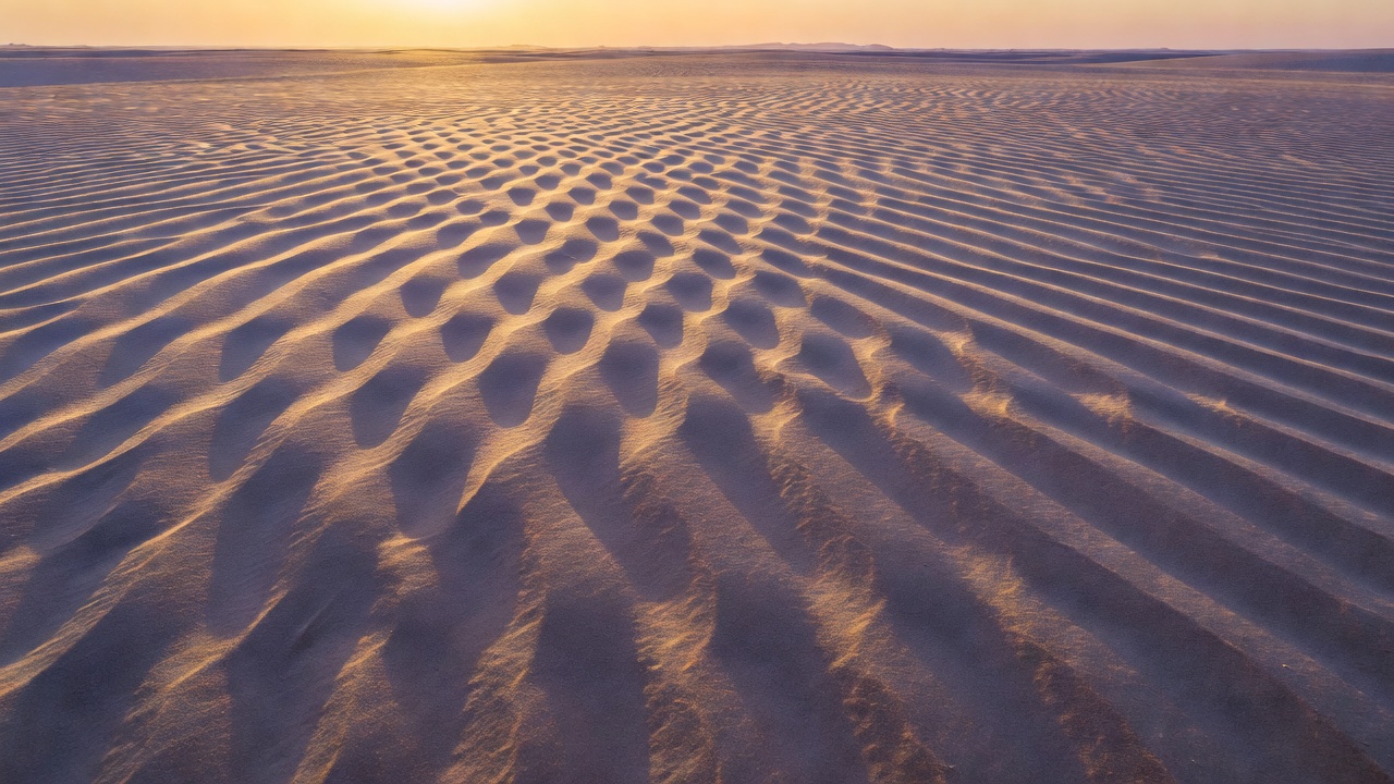
Texture becomes legible when neighboring parts of a surface receive different amounts of light. A low sun often exaggerates that difference, drawing a dark line beside each ridge. Higher or softer light reduces relief and may reveal color more clearly. If possible, observe the same patch at more than one time rather than immediately seeking a new subject. Make notes about the sun’s direction, not just the hour. A beautiful evening glow can still flatten a surface when it arrives from the wrong angle.
Choose whether to reveal the scale
A recognizable pebble, footprint or shrub tells the viewer how large the scene is. Without those clues, a small arrangement of sand can resemble an aerial landscape. Neither approach is inherently stronger. Decide whether you want an intimate document or a more ambiguous abstraction, then inspect the edges for clues that undermine that decision. Do not remove natural objects to simplify the frame. A different crop or camera position can usually achieve the necessary clarity without rearranging the place you came to observe.
Keep the important plane in focus
When photographing a relatively flat surface, keeping the camera sensor roughly parallel to it helps distribute sharpness more evenly. If the surface slopes away, additional depth of field may be needed. Very small apertures can soften fine detail through diffraction, so compare results rather than always choosing the smallest opening. A tripod is helpful when access rules and footing allow it. In wind, shield equipment without disturbing plants or creating unsafe obstacles. Avoid lens changes in blowing sand, and clean gear according to the manufacturer’s guidance.
Give repetition a reason to stop
Repeated lines create rhythm, but an entirely uniform field may leave the eye with nowhere to settle. A gentle bend, a change in spacing or one contrasting stone can make the pattern feel composed. Look for an entry point near an edge and a quieter area where the movement resolves. Try both a horizontal and a vertical frame. The same sand pattern can feel restful in one orientation and restless in the other. The intended wall may make that distinction more important than any traditional compositional rule.
Respect the surface beneath the picture
Some apparently empty desert ground contains fragile biological soil crust. It is not a background material to step across casually. Follow posted routes and site-specific guidance, and avoid creating new tracks for a cleaner photograph. White Sands National Park, Death Valley National Park and the Colorado Plateau offer very different materials and conditions; access restrictions and weather risks also differ. Do not assume that a familiar-looking dune is safe to enter. Check current information, avoid closed areas, and leave stones and other natural objects where they lie.
Edit for believable material
Heavy clarity and sharpening can turn soft sand into something brittle and metallic. Begin with modest adjustments, using local contrast only where it helps explain the surface. Keep an eye on bright mineral flecks and pale ridges: clipped highlights can erase precisely the detail you wanted to show. Compare color and monochrome versions thoughtfully. Removing color may strengthen a line-based composition, but it can also remove the subtle differences that distinguish sandstone from sand. Preserve the quality of the material rather than imposing a preset mood.
Let the print carry the final judgment
Texture is particularly sensitive to paper, output sharpening and viewing distance. A matte surface can feel sympathetic to sand and weathered stone, although it may render deep shadows differently from a glossier paper. Ask a printer for a sample rather than choosing from a screen alone. Inspect the print nearby, then step back to normal room distance. If all the visual interest disappears, the picture may need a different crop or a smaller display size. Pair it with a quieter landscape only when both images retain their own identity.