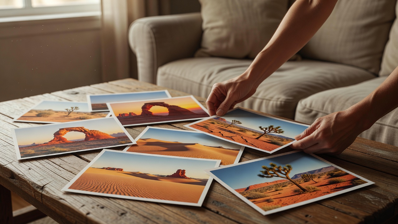
Begin with what the room needs
Stand at the doorway and notice where your eye goes before adding anything. A room with patterned textiles and open shelving may benefit from a landscape with broad, uncomplicated tones. A spare room may welcome a more detailed cactus portrait. This is not a rule about matching styles. It is a question of attention: should the photograph become a focal point, connect existing objects, or provide a visual rest? Choosing that role first makes later decisions about size and contrast much easier.
Test scale before buying a frame
Use paper cut to the proposed outer frame dimensions and attach it with a wall-safe method suitable for your finish. Include the mount and frame, not just the image area. Look from the doorway, the usual chair and the neighboring room. A photograph that seems generous at arm’s length can disappear above a substantial sofa. Conversely, a large high-contrast print may overwhelm a narrow passage. Live with the outline briefly if you can. Your normal movement through the room is a better guide than one staged photograph.
Relate the picture to furniture
Above a sideboard or sofa, think of the furniture and artwork as one arrangement. Start with a comfortable visual gap, then adjust by looking from ordinary seated and standing positions. There is no universal hanging height that works equally well with tall ceilings, low seating and differently sized frames. Keep the arrangement clear of lamps, doors and objects that may strike it. For heavy work, use hardware rated for the combined weight and appropriate to the wall construction. Ask a qualified installer when you are uncertain.
Choose conversation rather than exact color matching
A sand-colored print can sit beautifully beside warm wood, but its success may depend more on brightness and texture than on matching a specific shade. A dark cactus silhouette can connect a pale wall to darker furniture. A soft stone study may bridge linen and plaster. Bring samples into the actual room and look at different times of day. Artificial lighting can shift the apparent warmth of both paper and image. Avoid making an irreversible choice from a phone screen under a single lamp.
Let paper and framing support the image
Matte papers often suit restrained landscapes because reflections are less intrusive, although their shadow depth and surface texture vary. A smoother or glossier paper may give a detailed photograph a different sense of clarity. Request samples from the printer and ask about the complete ink-and-paper system rather than relying on the word “archival” alone. ISO 9706 concerns paper permanence; it is not a blanket guarantee for a finished photographic print. For preservation-focused framing, discuss suitable conservation materials, spacing from glazing and reversible mounting with an experienced framer.
Use a small series with restraint
Two or three pictures can create a gentle sequence: a whole landscape, a cactus portrait and a close texture, for example. Connect them through light, tonal range or subject relationship rather than forcing identical crops. Lay the arrangement out before making holes. Consistent gaps and one clear alignment can hold different image sizes together. Leave enough wall around the group for it to read as a whole. If one print repeatedly steals attention, change its position or scale before assuming the entire set needs to be replaced.
Protect the photograph from its surroundings
Avoid direct sunlight, heat sources and locations with repeated dampness or condensation. UV-filtering glazing can reduce some exposure, but it does not make a print immune to fading or environmental damage. Light exposure is cumulative, and visible light also matters. Keep framed photographs away from cooking splashes and do not spray cleaners onto the frame or glazing while it hangs. Follow the maker’s care instructions. The Canadian Conservation Institute and the Library of Congress provide useful starting points for understanding the care of photographic materials.
Allow the room to remain lived in
The final arrangement should make everyday life more pleasant, not create an area that everyone is afraid to touch. Leave useful surfaces useful. Keep circulation clear and avoid balancing an unsecured frame where a child, pet or passing sleeve could knock it over. Once the print is installed, stop comparing it only with idealized room photographs. Notice how it feels while reading, talking or walking past in ordinary light. A successful desert image can become familiar without becoming invisible: a small invitation to look more carefully, every day.